
Lost Cause
Seeing America Through the Losing Candidates’ Map
If the winners write the history books, they also make the maps.
After every Election Day, we see a variety of maps showing how the race was decided. They differ in sophistication and type, but they all show the same thing: Who won.
Here is the opposite view. We’ve mapped the counties that supported the losing candidate in every presidential election since 1828.
The maps, stripped of party colors, trace the history of American politics from underneath it. Through them we can explore a geography of opposition, where the prevailing opinion was rejected, and where resentment was birthed or fostered. They locate the disgruntled and disaffected. They presage conflict and even civil war. Looking at these maps you can see the impact of historical trends: urbanization, party realignment, the emancipation of slaves and civil rights. You can see how red and blue states have rarely been that homogenous. You can even see how geological features created over millions of years ago still influence our politics today.
Take a tour of history through the lens of the losers.
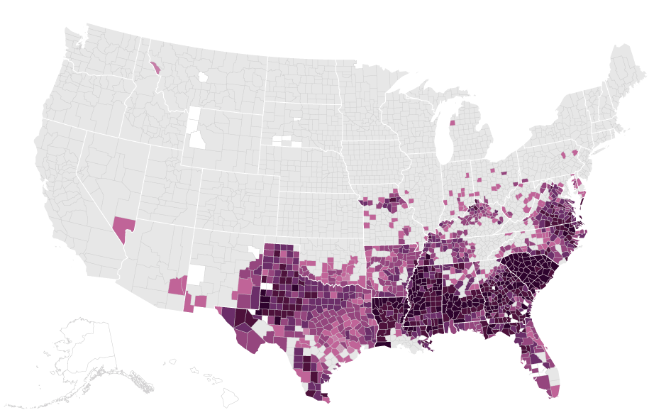
The North/South Divide
In the late 19th and early 20th centuries, the country was divided between North and South. After Reconstruction ended in 1877, says Georgetown University history professor Michael Kazin, the Democrats constructed a “Solid South” based on antipathy toward Republicans – the party that had defeated the Confederacy, ended slavery, and enfranchised black men. Meanwhile, Northern states mostly backed Republicans for president. From 1876 to 1928, Democrats lost 10 of the 14 presidential elections, which you can see in the repeating pattern of a dark purple across the South.
“These maps really show Southern voters behaving in a way that is entirely different from the rest of the country,” says Peter Kastor, a political historian at Washington University in St. Louis. Anyone looking at the maps of the first half of the 20th century would say to themselves, “Wow, the South is incredibly committed to the Democrats!”, says Mitchell Lerner, an associate professor of history at Ohio State University.
Until suddenly, everything changes.

1876 - 1928
Counties carried by a losing candidate, by percentage of the total vote

Counties carried by
the winning candidate
Unorganized territories/
No data available
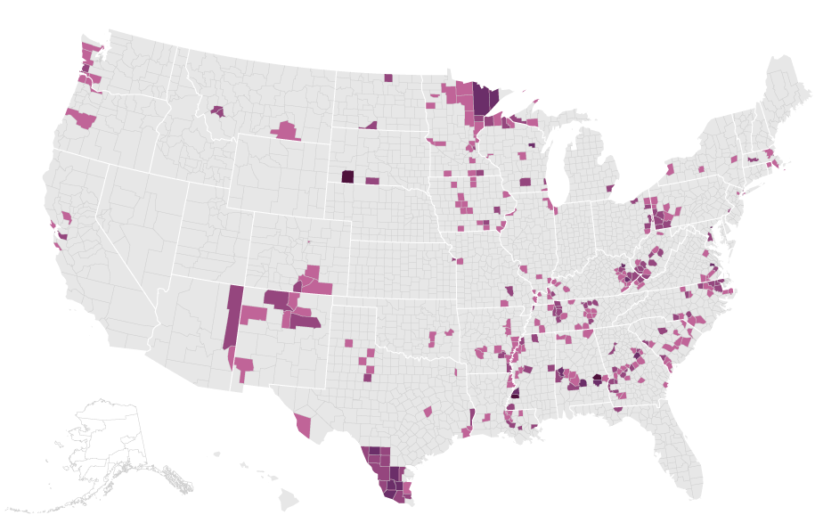
The Southern Flip & Civil Rights
After years of overwhelmingly Southern support for Democrats, the historical regional alignment flips. Why? The civil rights movement.
After Democrat Harry Truman makes the first very small steps towards civil rights in the run-up to the 1948 election, says Lerner, the South starts a sharp turn away from the party. By 1964, the South is the only region that votes for conservative Republican Barry Goldwater and against the Democrat Lyndon Johnson, who wins one of the most lopsided victories in U.S. history. And, in the South, things only get worse for the Democrats after that.

1900
Loser: Bryan (Democrat)
Winner: McKinley (Republican)

1904
Loser: Parker (Democrat)
Winner: Roosevelt (Republican)
1920
Loser: Cox (Democrat)
Winner: Harding (Republican)

1924
Loser: Davis (Democrat)
Loser: La Follette (Progressive)
Winner: Coolidge (Republican)
“What these maps show us is an almost complete reversal of regional party loyalties that transpires in the middle of the century, due primarily (although not exclusively) to the civil rights movement,” says Lerner.

1964
Loser: Barry Goldwater (Republican)
Winner: Lyndon B. Johnson (Democrat)
The New England Flip
The South was not the only region that flipped from one party to another. Northern New England in particular shifted from supporting Republican candidates to voting against them, according to Larry Knopp, a geographer at the University of Washington Tacoma.
Vermont, for example, was a solidly Republican state as late as 1988, but in recent elections, such as 2004, it voted for Kerry, the Democratic candidate.
“It’s largely migration patterns and cultural change that have flipped Vermont so that now it’s the home of Bernie Sanders,” said Knopp. People moving north out of the urban centers of New York and Boston have also changed Maine and New Hampshire, which have also been historically Republican states but now are leaning Democrat.

1920
Loser: James M. Cox (Democrat)
Winner: Warren G. Harding (Republican)

2004
Loser: John Kerry (Democrat)
Winner: George W. Bush (Republican)
1976
The 1976 election is unlike any other, according to Geoffery Skelley of the University of Virginia Center for Politics. Republican Gerald Ford wins most counties west of the Mississippi, while losing most of the South and a sizable number of counties in the Northeast and Midwest. This creates more of an East-West divide than the typical North/South one. But with the 1976 race being remembered as the American people’s response to Watergate, it’s hard to draw long-term conclusions from it.
This would be the last time that a Republican would lose the states of Mississippi and Alabama.

1976
Loser: Gerald Ford (Republican)
Winner: Jimmy Carter (Democrat)
The Bellwether
Ohio, as any election wonk will tell you, has voted for the winner in every presidential contest since 1964. The 2016 election was no exception, with Ohio going for Trump by almost half a million votes.
But despite its consistency as a state, a closer look at county-by-county results shows that Ohioans are anything but unanimous in their vote. In five elections since 1964, the majority of Ohio’s counties voted for the loser of the race. The maps from 2008 and 2012 are especially striking, showing most counties voting overwhelmingly against Barack Obama. His support comes mainly from the big cities, including Cleveland, Columbus, Cincinnati and Dayton. These show up as small gray islands scattered across a purple sea.
That pattern – cities versus the rest of the state – repeats in 2016, with most major cities voting for Clinton, with one notable exception: Dayton.

Ohio, 1964 - 2016
Similar Maps, Vastly Different Elections
Some of these maps make striking juxtapositions. Take the 1984 election, in which Walter Mondale was defeated in a landslide, losing every state but his native Minnesota. At the county level, the defeat is somewhat less homogenous. If history credits “Reagan Democrats” with Mondale’s defeat, this is likely a map of Mondale Democrats.
Compare 1984 to 2000, with Al Gore losing the electoral vote by a tiny fraction and winning the popular vote. For elections that had such dramatically different outcomes, their maps look remarkably similar. One of the reasons for that betrays a central truth about maps – they prioritize geography over population. So Northeastern counties with millions of people can seem less important than the wide open and empty counties of the Desert West.
“These maps force us to think about space in two different ways,” says Kastor, the political historian from Washington University in St. Louis. “The literal representation of space, and what is within that space.”
1984
Loser: Walter Mondale (Democrat)
Winner: Ronald Reagan (Republican)

2000
Loser: Al Gore (Democrat)
Winner: George W. Bush (Republican)
Questioning History
These maps spur us to reconsider the received wisdom about historical elections and the presidency.
Take Franklin Roosevelt, the “elephant in the room in any discussion of the presidency,” says political historian Kastor. While Roosevelt is remembered as a wildly popular president throughout his over 12 years in office, these county maps tell the story of his attenuating popularity over the course of his presidency.
Disaffection with FDR spreads like a contagion from Vermont and Maine through the upper half of the country. By his last re-election campaign, more counties are putting their support behind someone else than had ever before.
According to Kastor, many people in Roosevelt’s inner circle, including some of his closest advisers, did not believe he was physically qualified to run in 1944. These maps show that large portions of the U.S. voted against him.

1932
Loser: Hoover (Republican)
Winner: Roosevelt (Democrat)

1936
Loser: Landon (Republican)
Winner: Roosevelt (Democrat)

1940
Loser: Willkie (Republican)
Winner: Roosevelt (Democrat)

1944
Loser: Dewey (Republican)
Winner: Roosevelt (Democrat)
The Urban/Rural Divide
Since 2000, we’ve all heard plenty about red states and blue states. But according to Kenneth Osgood, a history professor at the Colorado School of Mines, these terms are not very helpful for understanding the overall contours of our current political universe. Far more important is the urban/rural divide, which has mostly replaced the North/South divide of the previous century.
“The story of the polarization of the U.S. is one that maps itself out in place and space,” says Margaret O’Mara, a history professor at the University of Washington. According to O’Mara, these maps show the U.S. changing from a rural nation to an urban one, with an increasing concentration of population in city centers. Those urban areas tend to be more progressive, and vote for Al Gore in 2000.
But not far from those urban areas are more rural, Republican-leaning areas, which vote overwhelmingly for Mitt Romney in 2012. The distances between these counties may be small, but the differences are large: education levels, church-going patterns, economic prospects. These are the new things that divide us.
That said, the current levels of polarization are nothing extraordinary, according to Bryce Ward, an economist who co-authored a 2005 paper called Myths and Realities of American Political Geography. While partisanship has risen, says Ward, “the geographic polarization that exists currently is not outside of the long-term norm of U.S. politics.”
2000
Loser: Al Gore (Democrat)
Winner: George W. Bush (Republican)

2012
Loser: Mitt Romney (Republican)
Winner: Barack Obama (Democrat)
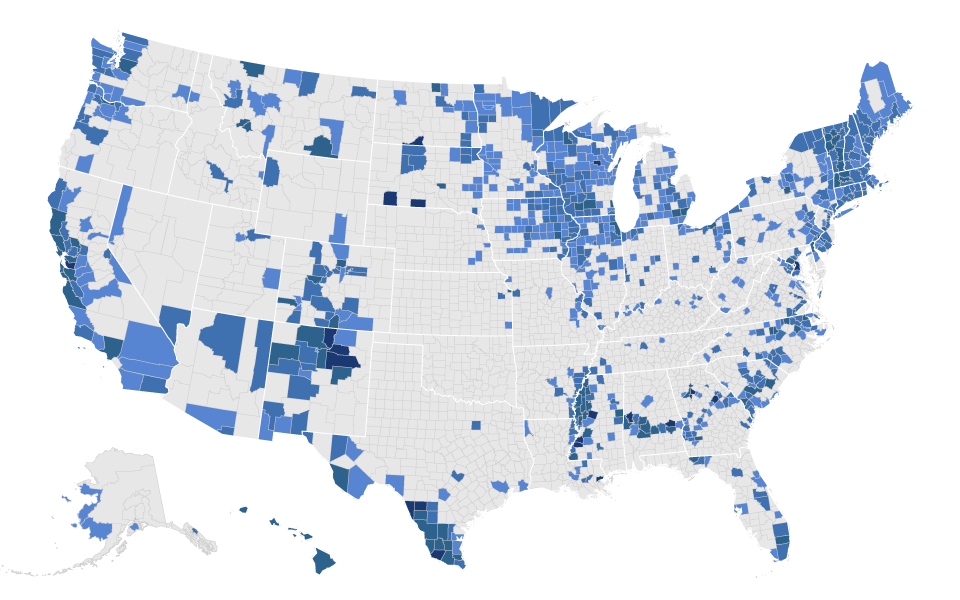
The Mississippi River Clusters
There are two clusters of Democratic-leaning counties along the Mississippi that don’t often get talked about, according to Knopp, the University of Washington Tacoma geographer. One is a cluster in the South, along eastern Arkansas, western Mississippi and south western Tennessee. These Democratic voters, primarily African American, are a stark contrast to the otherwise deeply conservative region. Spread across several different states, they are typically outvoted by other parts of their states. That’s why they often disappear from state election maps, and can only be seen at the county level in elections like 2000. Their strong support for Al Gore appears as a cluster of purple dots.

2000
Loser: Al Gore (Democrat)
Winner: George W. Bush (Republican)
The other Democratic cluster is visible along the upper Mississippi River, in western Illinois, southwestern Wisconsin, and eastern Iowa. These counties are the reason why Wisconsin and Iowa have leaned Democratic in the last several election cycles, despite the demographics of these states overall: mostly rural, mostly white. “Despite its demographic homogeneity in terms of whiteness, this region has somehow escaped the Republican strategy of mobilizing white voters,” says Knopp. But for that little cluster, the states of Wisconsin and Iowa would have gone for the Republican candidate. While they take up much less real estate than the rest of the state, in 2000 they were enough to turn the region for Al Gore.

2000
Loser: Al Gore (Democrat)
Winner: George W. Bush (Republican)
The Anti-Obama Map
What jumps out about this map “is just how very different the 2008 and 2012 elections look to most previous contests,” says Charles Pattie, a geographer at the University of Sheffield. According to Pattie, it suggests competition between big city America and small town America, a very different pattern than the one the Civil War imprinted on maps 150 years ago.
The 2008 map shows large swaths of the country in purple. These counties voted overwhelmingly for John McCain. Obama’s support, on the other hand, comes mostly from highly concentrated metropolises, as well as places settled by racial and ethnic minorities: Latinos in southern Texas, New Mexico and Arizona, and African Americans in parts of Mississippi, Alabama and the Carolinas.
Among other things, the 2008 map “shows us the lingering influence of race in American elections," says Manisha Sinha, Professor of Afro-American Studies at the University of Massachusetts, Amherst.

2008
Loser: John McCain (Republican)
Winner: Barack Obama (Democrat)
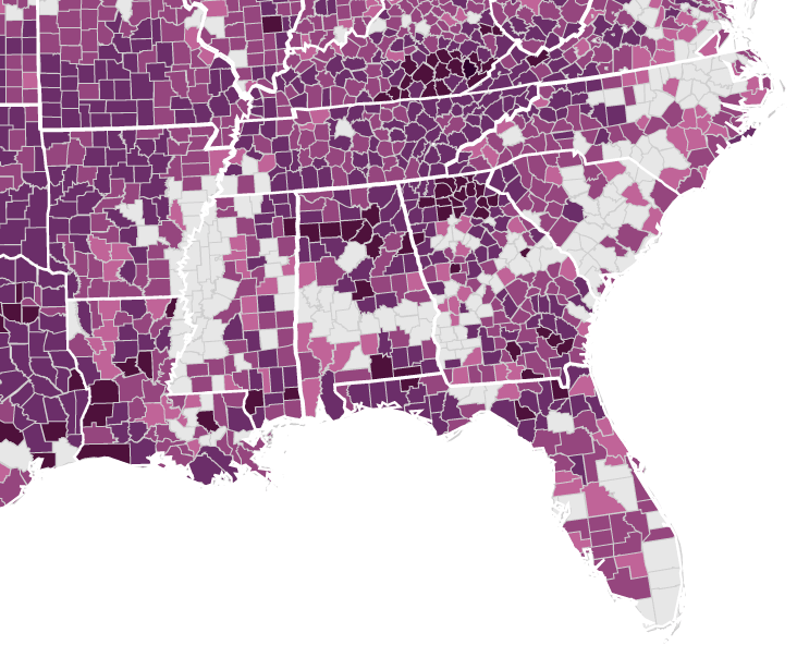
The Black Belt
A recurring feature that shows up again and again is the distinct voting pattern of the region known as the “Black Belt,” a crescent-shaped area that runs from the lower Mississippi River to North Carolina. That region, known for very rich fertile soil, was prime cotton-growing land in the slavery-era south. That soil can be traced back 85 million years, when it was an ancient shoreline.
Today a large number of African Americans still live in the area, many of whose ancestors were brought to the region as slaves. They vote with striking consistency, rejecting Republicans and supporting Democrats overwhelmingly.

2004
Loser: Kerry (Democrat)
Winner: Bush (Republican)
2012
Loser: Romney (Republican)
Winner: Obama (Democrat)

_Western_Interoir_Seaway_map_PLoS_ONE.png)
The 2016 Election
Many of the historians we spoke to predicted that the political coalitions seen in the recent past would remain mostly consistent in 2016. In some ways that’s what came to pass. Clinton’s votes came from the highly educated cities on the coasts, the same places that supported Obama – and Gore before him.
2000
Loser: Al Gore (Democrat)
Winner: George W. Bush (Republican)

2016
Loser: Hilary Clinton (Democrat)
Winner: Donald Trump (Republican)
But in other ways, the pattern of voters who turned out for Trump was a shift from the past. In particular, white people without a college education gave Trump a large lead in counties that voted for Obama. The visual difference between 2008 and 2016 is dramatic in much of the upper midwest, where mostly rural counties likely proved decisive in several key states, such as Ohio, Iowa and Wisconsin.
↓ Select a year below to see only that map ↓
2008
Loser: John McCain (Republican)
Winner: Barack Obama (Democrat)
2016
Loser: Hilary Clinton (Democrat)
Winner: Donald Trump (Republican)
In New York and California, Clinton won by millions, putting her 20 to 30 points ahead of Donald Trump. But those surplus votes were not enough to offset small shortfalls in swing states such as Michigan and Pennsylvania, where she lost by less than one percentage point. This is how Clinton, like Gore before her, won the popular vote but lost the election.